
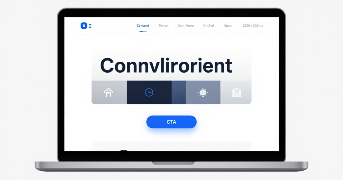
How many times have you visited a website and thought: "I wouldn't buy here even if they paid me"? Probably more times than you remember. The reality is that web design isn't just an aesthetic matter. It's a silent persuasion tool that, when used well, converts visitors into customers. And the best part: you don't need to be a professional designer to achieve it.
At SkillsHub MCP, we know that many entrepreneurs, small businesses, and freelance professionals don't have the budget to hire expensive designers. That's why we're showing you how to create a website that sells by applying psychological and practical principles that work. With a bit of strategy and the right tools, your website can be a 24/7 sales machine.
1. Understand buyer psychology before touching anything
Before changing a single color or moving a button, you need to understand something fundamental: people don't visit your website to admire your design. They arrive with a problem and are looking for a quick solution.
When you design your website, think about your customer's journey. They land on your home page, and in less than 3 seconds they need to understand:
- What exactly you do
- Why they should care
- What the next step is
Forget about "welcome to our site" and lengthy introductions. A clear headline that solves a specific problem works 10 times better. Instead of "Innovative digital solutions," write "Increase your sales in 30 days with intelligent automation."
Practical tip: If you're a productivity coach, your main heading shouldn't be "Professional productivity coach," but something like "Gain 10 hours every week without giving up anything." The difference is that one talks about you, and the other solves the visitor's problem.
2. Visual design that guides without distracting
Here's the good part: you don't need complicated designs to sell. In fact, overloaded designs usually scare customers away. The key is in visual hierarchy: deciding what you want the visitor to see first.
Imagine your website as a conversation. You don't throw all the information at once. First you capture attention, then you explain the benefit, then you provide proof, and finally you ask the question: "Are you interested?"
Key elements:
- Colors: Use a maximum of 3 main colors. One for the background, one for text, and one for action buttons. A red or green CTA (Call to Action) button stands out more than a gray one.
- Typography: Maximum 2 font types. One for headings and another for body text. Avoid weird fonts that read like modernist poetry.
- White space: Breathe. White (or empty space) is your friend. It makes content more readable and the page less overwhelming.
- Images: Use real photos of people (not obvious stock photos). People buy from people, not from generic illustrations.
With tools like Figma (free up to a point) or even Canva Pro, you can create professional designs without being a designer. Most modern templates already have these rules built in.
3. Structure your content to convert, not to impress
Your page flow should be as natural as a conversation with a customer in a store. Here's a structure that works:
- Hero Section (the first thing you see): Headline + clear subtitle + CTA button + image or video
- Problem + Solution: Describe the customer's pain, then show how you solve it
- Benefits: 3-5 main benefits with simple icons
- Social proof: Real testimonials, success stories, impressive numbers
- Final CTA: A clear button that invites action
The secret? Less is more. A page that sells isn't an encyclopedia. It's a directed conversation. Don't try to explain everything on the home page. Details go on secondary pages.
Practical example: If you're selling an online course about "Mastering Claude AI to automate your work," your structure would be:
"Do you spend 5 hours daily on repetitive tasks?" → Problem identified
"With these 3 Claude techniques, automate 70% of your work" → Clear promise
"Save time. Increase productivity. Learn fast" → Benefits
"Pedro saved 15 hours weekly and relaunched his startup" → Social proof
"Access the course now for $49" → CTA
Going to install a Skill? Analyze it first
Detect malicious code, leaked secrets, and prompt injection in seconds. Free.
Analyze a Skill4. Optimize for mobile first (because nobody uses desktop)
This isn't a suggestion. It's a rule. 75% of users browse on mobile, so design thinking about small screens first.
What does this mean?
- Large, easy-to-tap CTA buttons (minimum 44x44 pixels)
- Readable text without zooming (minimum 16px)
- Simplified menu (better a hamburger than a mega-menu)
- Optimized images that don't slow down loading
- Short forms (ask for a maximum of 3 things)
A slow website is a website that doesn't sell. If your page takes more than 3 seconds to load, you lose customers. Use tools like Google PageSpeed Insights to verify.
5. Calls to action that actually work
The CTA button is the most important thing on your entire website. Here are the classic mistakes:
❌ Bad: "Submit" | "Next" | "Click here"
✅ Good: "Get access now" | "See my proposal" | "Book free call"
The difference is intention. The button should communicate exactly what will happen next. The visitor should feel they're gaining something, not doing a favor.
And place multiple CTAs on your page. One at the top (hero), one in the middle (after benefits), and one at the bottom. Not everyone scrolls to the end, but those who do deserve another chance to convert.
6. Metrics: Measure to improve
A website that sells is a website that evolves. Install Google Analytics (free) and observe:
- Where do people enter? (traffic)
- What do they read? (time on page)
- Where do they leave? (bounce rate)
- How many convert? (conversions)
Each month, make small changes and measure the impact. Maybe changing the button color increases clicks by 15%. Perhaps a different headline retains more people. The magic is in the details.
Conclusion: Your website is a 24/7 salesperson
Designing a website that sells doesn't require professional design skills. It requires clarity of purpose, understanding of the customer, and the willingness to constantly optimize. Simply, think like a salesperson: what does someone say in a store to make you buy? That's what your website should do.
Remember: every element must have a reason. There's no room for vanity on a commercial website. Everything serves one goal: converting visitors into customers.
Now, if you want to take your website (and your business) to the next level, you need intelligent automation. This is where Claude AI comes in. At SkillsHub MCP, we offer specialized Skills that integrate Claude into your workflow: from generating persuasive content to automating customer responses. Download our tools at skillshubmcp.com and discover how Claude can power your digital sales machine.
¿Prefieres escuchar el contenido? Genera la narración de audio con un clic.